
Description
Hub Mobile App — UX Case Study
Role: UX/UI Designer
Project Type: Independent / Self-Initiated
Platform: Mobile App (iOS concept)
Status: In Progress (Hi-Fi Prototype)
Project Overview
The Hub Mobile App is a self-initiated UX project inspired by my experience as a bootcamp student and later as a graduate navigating coursework, events, meetings, and job-search tasks across multiple platforms. While the program emphasized a desktop-first experience for completing sprints and assignments, I identified a gap in the mobile experience—particularly for staying informed, organized, and proactive when away from a desktop or laptop.
This project explores what a student-centered Hub mobile app could look like if it focused on clarity, reminders, and task continuity rather than replacing the desktop workflow.
Problem Statement
Students and graduates rely heavily on emails, websites, and third-party tools to track updates, events, meetings, and deadlines. Important information is often buried across platforms, leading to missed updates, confusion, and cognitive overload.
How might we design a mobile Hub experience that simplifies access to critical information—without disrupting the desktop-first learning model?
Research & UX Strategy
This project was grounded in:
Personal experience as a bootcamp student and graduate
Observations and feedback from fellow students
UX principles focused on cognitive load reduction and task recall
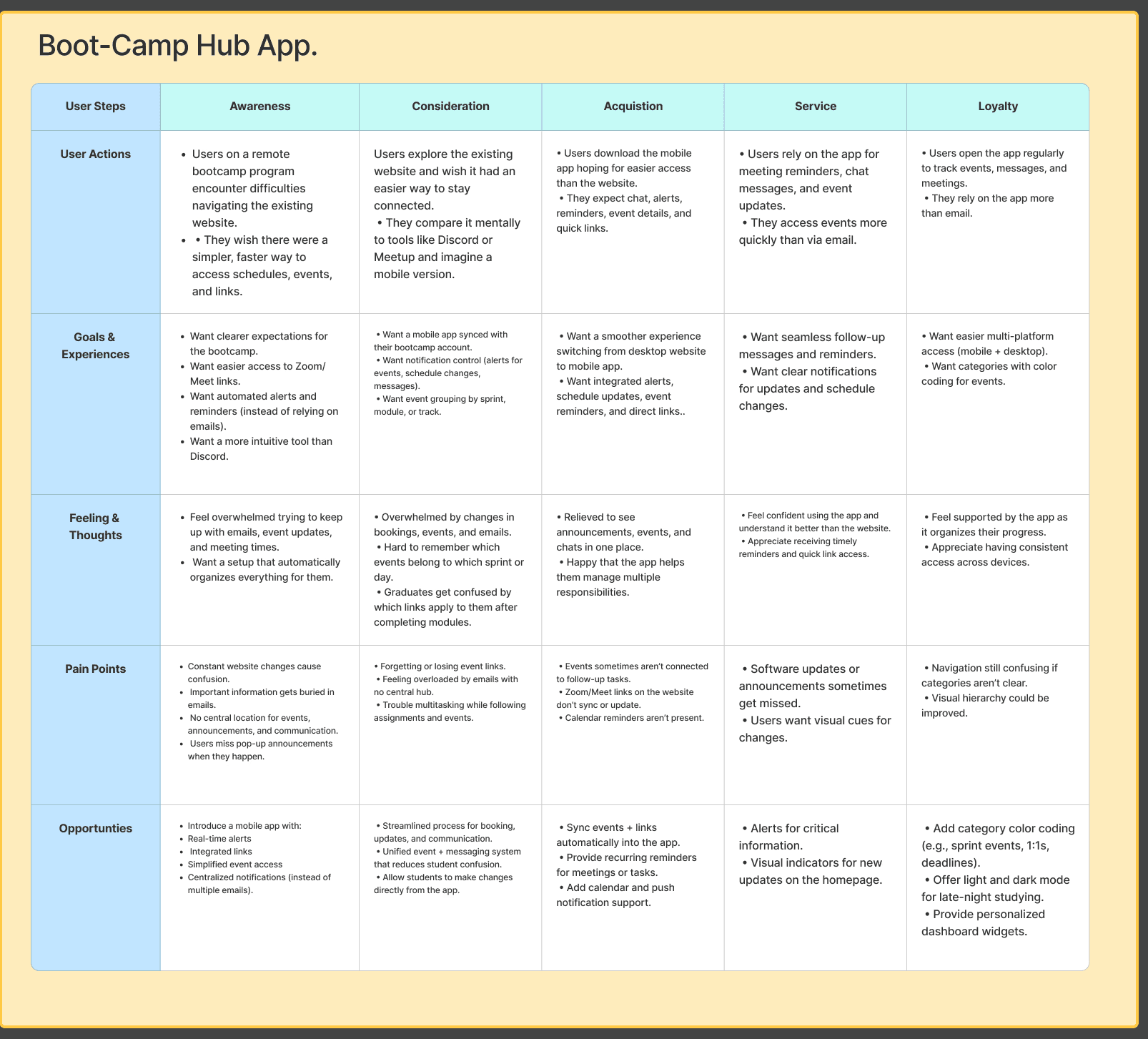
Through this research, I mapped the student journey from awareness to loyalty, identifying key pain points such as:
Missed announcements and reminders
Difficulty tracking meetings and events
Fragmented communication across email, chat, and web platforms
(See: User Journey Map visual)
User Perspective
The primary user for this flow is a graduate who:
Has completed the program and earned certification
Is actively job searching
Needs to continue attending events, meetings, and completing follow-up tasks
Wants to demonstrate ongoing growth without constantly searching emails or websites
The app acts as a course and productivity companion, supporting daily and weekly tasks through reminders, alerts, and quick access links.
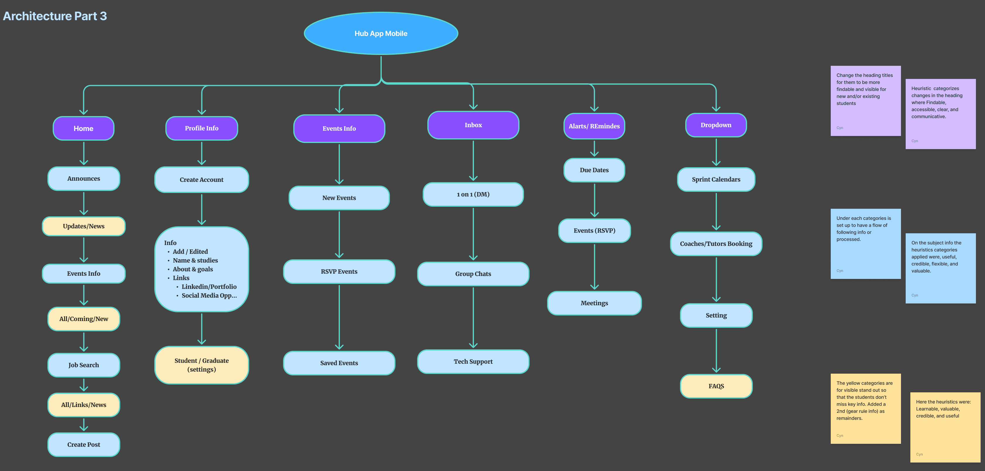
Information Architecture
I designed the app structure to prioritize:
Visibility of critical updates
Clear categorization of events, reminders, and communications
Reduced navigation friction
Key sections include:
Home (announcements, updates, events)
Events & RSVP
Alerts & Reminders (due dates, meetings, deadlines)
Inbox (direct messages and group chats)
Profile & Settings (student/graduate status)
(See: Information Architecture diagram)
Design Approach
Throughout the process, I challenged myself to:
Work independently without tutor guidance
Apply UX heuristics and accessibility principles
Iterate continuously, even after reaching a “finished” state
Each iteration surfaced new opportunities—such as implementing Dark Mode and refining visual hierarchy—to improve usability and comfort for extended use.
I intentionally kept the interface simple, not for convenience, but to support proactive task completion in moments when users are mobile, distracted, or short on time.
Outcome & Reflection
This project represents:
A full UX process from research to high-fidelity design
Proof of applied learning beyond coursework
A growing portfolio piece demonstrating independent problem-solving