
Description
Project Overview
SteadyFit is a mobile fitness app concept designed to help beginners and busy professionals stay consistent with workouts. Developed as a Capstone Project, the app addresses major gaps found in competitor products—overly complex UIs, lack of reminders, and too many steps before starting a workout.
The goal was to create an app that feels approachable, simple, and motivating, while keeping users engaged through personalized reminders, quick-start workouts, and visual progress feedback.
My Role and Duration
Role: UX/UI Designer
Tools: Figma, Miro, Google Forms
Timeline: 4 weeks
Responsibilities:
Conducted competitor research and user interviews.
Created personas and identified user pain points.
Designed user flows, wireframes, and branding explorations.
Built lo-fi and hi-fi prototypes in Figma.
Ran usability tests and refined features based on feedback.

One of User Interview participant of the UX Research Summary and (3 key takeaways) "Need for flexibility – Fitness routines must adapt to unpredictable schedules without penalty."
The Problem
Most fitness apps overwhelm new users by requiring long sign-ups, complicated flows, and intimidating dashboards. Many also lack consistent reminders, making it harder to form habits. As a result, beginners often abandon these apps within days.
The challenge was to design an app that feels simple, supportive, and motivating, giving users confidence to stay consistent without being overloaded.

This is the Lo-fi Desktop design in process. (Link Below)
Goals
Reduce steps to start a workout by at least 40% compared to competitors.
Build a reminder system that feels personal and reliable.
Create a clean dashboard that gives clarity, not clutter.
Explore two branding directions (energetic vs. approachable) to see how tone impacts user perception.
Incorporate progress tracking and celebratory feedback to increase motivation.

Here the mobile flow from login start to finish and sitemap part system planning.
Design Process
1. Research & Insights
Competitor Analysis:
Nike Training Club → great variety but too many setup steps.
FitOn → fun challenges but inconsistent reminders.
Strong App → powerful logging but overwhelming UI.
User Interviews (3 beginners & casual exercisers):
Valued simplicity, reminders, and encouragement.
Key insight: Users wanted to feel guided, not overwhelmed.
2. Persona Development
Created Alex, 29, a busy professional who wants short, effective workouts after work.
Alex’s needs shaped SteadyFit’s priorities: fewer steps, better reminders, approachable tone.
3. Ideation & Wireframes
Focused on quick-start workouts, customizable reminders, and a minimal dashboard.
Sketched lo-fi wireframes to validate flows before visual design.
4. Branding Challenge (Two Explorations)
Energetic Direction: Bright colors + bold typography for motivation.
Calm Direction: Cool palette + rounded typography for approachability.
Goal: Test how branding can shift user trust and engagement.
5. Usability Testing
Tested with 3 users.
What worked: Users loved the quick-start option and uncluttered UI.
Needs improvement: Requested more visual feedback (progress tracking, celebrations).
Iteration: Added progress indicators, celebratory animations, and refined reminder settings.
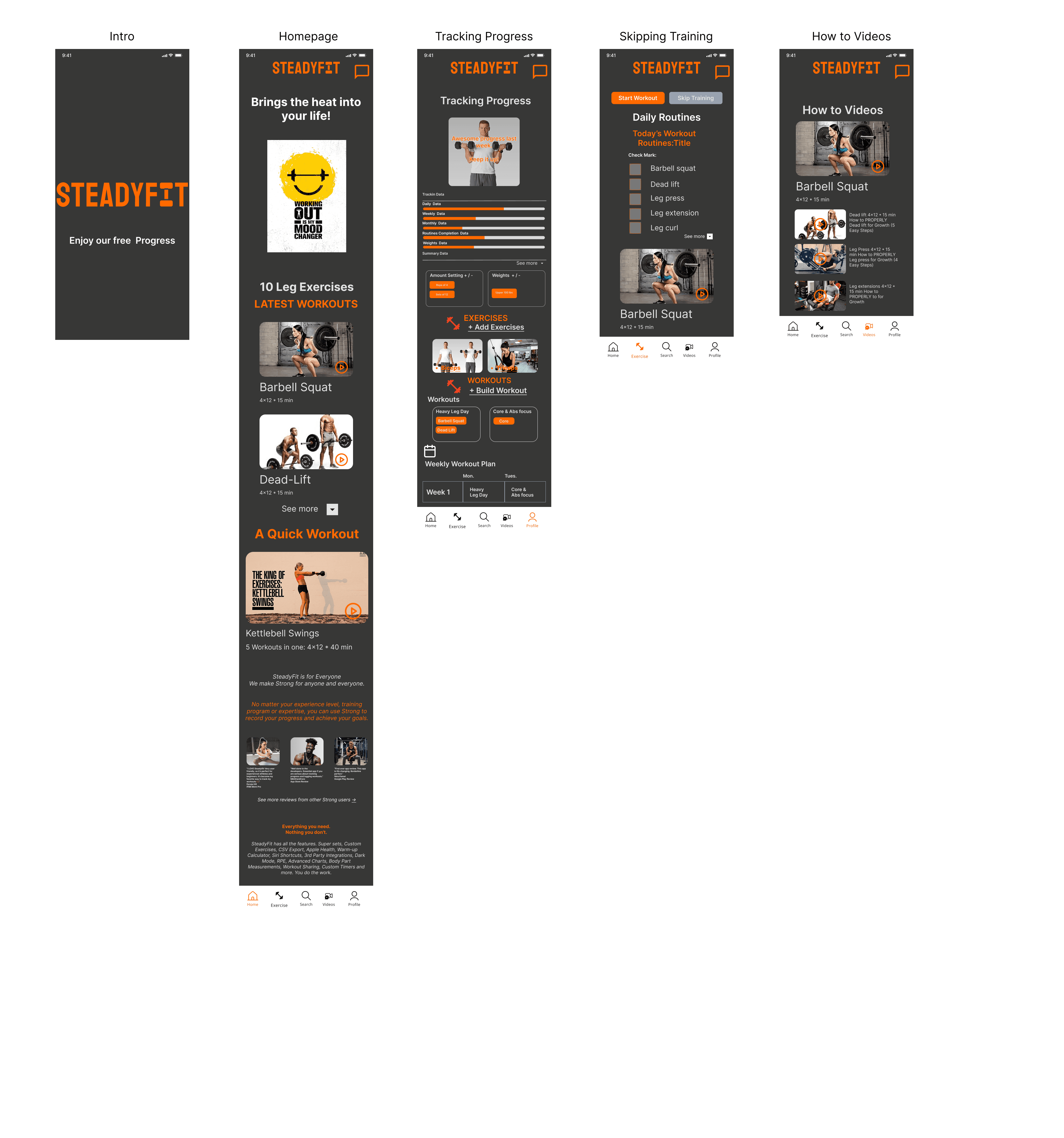
The project Hi-fi Mobile final program app settings.
Results
Reduced workout start steps by 40% compared to Nike Training Club.
Designed a reminder system aimed at habit-building and retention.
Developed a flexible branding system adaptable to different audiences (beginners vs. more advanced users).
Early user testing showed strong preference for the simplicity and guidance SteadyFit provided.
Lessons Learned
Even small usability tests can uncover critical pain points.
Branding has a major influence on user trust and perception.
Always tie design choices back to real user needs and competitor gaps.

A full Control Components for any changes or updates necessary.